How to Create Accessible Medical Slides for Colorblind Audiences?
In medical communications, clarity is a patient safety issue. If a healthcare professional (HCP) cannot distinguish between a healthy artery and a diseased one because the slide relies solely on subtle red-green differences, the educational value is lost. Accessibility is not just about compliance; it is about ensuring that complex pharmacological and anatomical data is instantly comprehensible to everyone.
Drawing from the expert design architecture of the RxSlides library, here is a guide to creating accessible medical presentations that do not rely exclusively on color perception.
1. Leverage High-Contrast "Double-Coding"
"Double-coding" means providing two ways to understand information: color plus shape or text. Relying on color alone is a critical error. Instead, use high-contrast palettes paired with distinct shapes.
The "Orange and White" Contrast: In the Scoliosis PowerPoint Template, the design avoids low-contrast blends. It uses a "high-contrast white and orange/red color scheme" where the subject (a stylized silhouette of a human skeleton) stands out sharply against the background. This ensures that even those with achromatopsia (total color blindness) can distinguish the focal point.
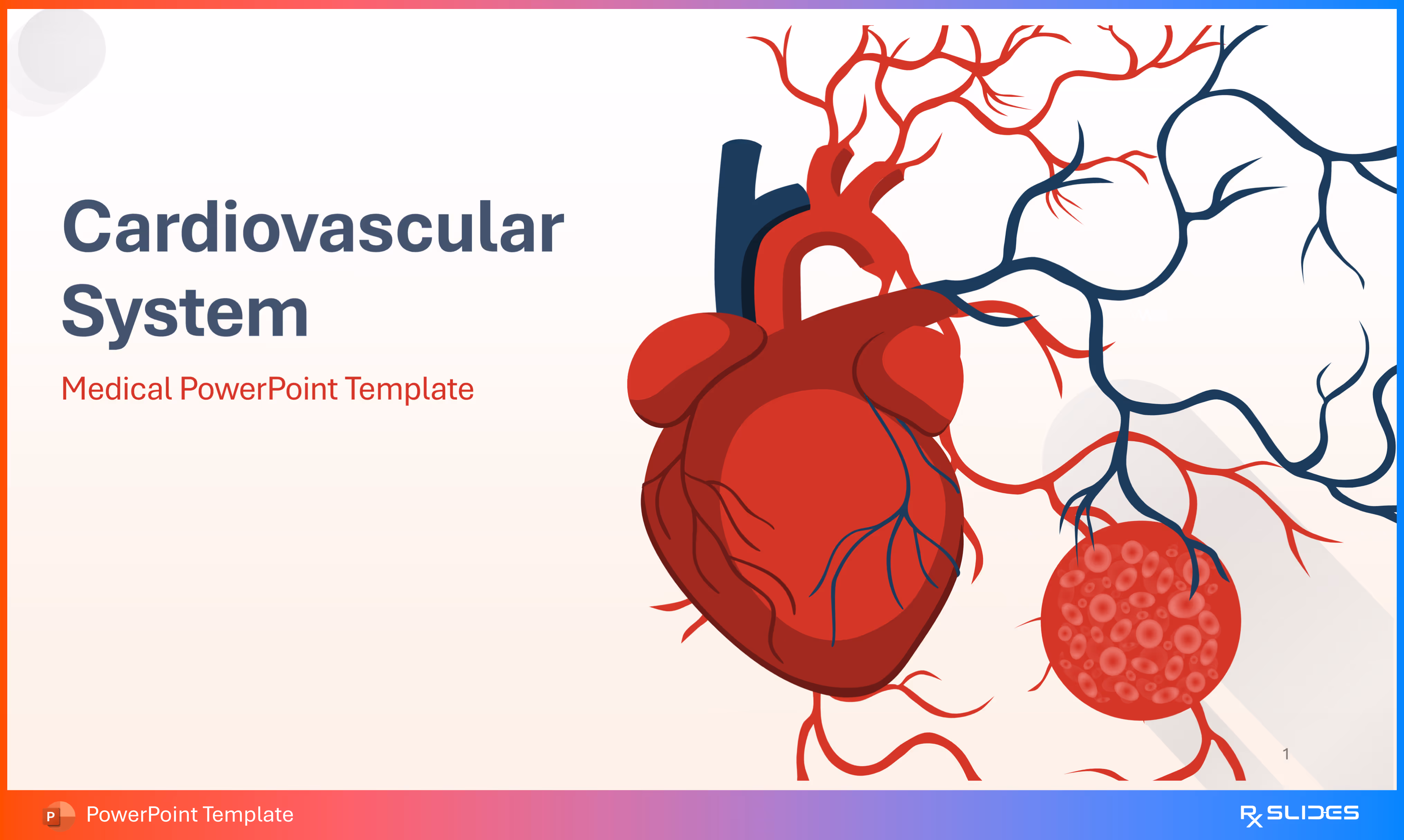
The "Red and Dark Blue" System: The Cardiovascular Anatomy & Physiology Template utilizes a primary palette of "red, dark blue (navy), and white." By using a very dark blue against a vibrant red or white background, the design creates sufficient luminance contrast, allowing elements to be distinguished by brightness even if the viewer cannot perceive the hue.
2. Use Comparison Layouts with distinct Textures
When comparing a healthy state to a diseased state, avoid relying on a simple color change (e.g., pink tissue vs. red tissue). Instead, use side-by-side comparison layouts that emphasize structural changes.
Split-Screen Anatomy: In the Atherosclerosis Template, the definition slide uses a side-by-side comparison. It visualizes a "Healthy Artery" with a clear lumen next to an artery with "Atherosclerosis" filled with plaque material. The visual distinction is structural (open vs. narrowed), not just color-based.
Magnified Comparisons: The Asthma PowerPoint Template compares a normal airway to an asthmatic one using distinct anatomical cross-sections. The "asthmatic airway" is not just redder; it is visually "constricted" with visible mucus and inflammation, making the pathology clear regardless of color perception.
3. Replace Legends with Direct Labeling and Icons (check)
Legends that require a user to match a colored dot in a chart to a colored word in a list are notoriously difficult for colorblind users. The RxSlides approach moves labels directly onto the graphic or uses icon-anchored grids.
Icon-Anchored Lists: In the Urinary Incontinence Template, risk factors are not listed in a color-coded bullet list. Instead, they are presented in a "clean grid of four boxes," where each factor (obesity, age, etc.) is paired with a specific icon and a category title.
4. Structure Data with Patterns, Not Just Hues (check)
When presenting epidemiological data or prevalence maps, use distinct patterns or clearly separated shapes rather than subtle gradients.
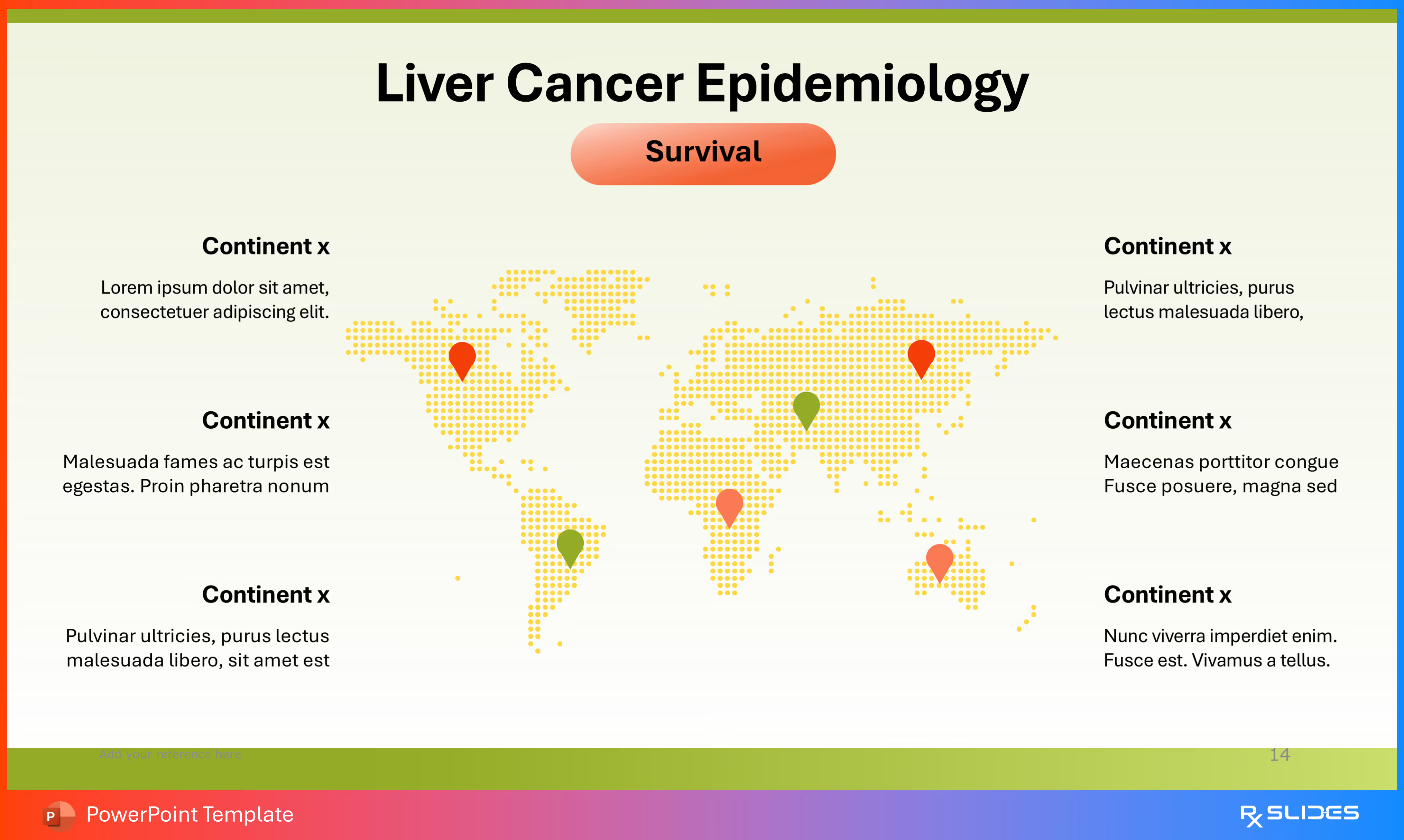
The "Pin" Method: The Liver Cancer Template uses editable maps for epidemiology. Instead of a heat map that might blur together, it uses "location pins" to mark specific regions, ensuring the data points are spatially distinct.
Segmented Visuals: The Celiac Disease Template uses a "central, segmented circle featuring multiple icons" (people, bar charts) to organize statistical information. By breaking data into distinct segments with icons, the information remains distinct even if the colors look similar.
Accessible vs. Inaccessible Design Strategies
The following table outlines the shift from traditional, color-dependent design to the accessible, structural design found in RxSlides templates.
Feature
Inaccessible Method (Color-Dependent)
Accessible Method (RxSlides Visual Hierarchy)
Pathology Comparison
Changing tissue color from pink to red to indicate inflammation.
Structural Change: Showing the "narrowing of the vessel" or "visible mucus" alongside the color change.
Data Visualization
Pie charts using red and green segments with a separate legend.
Icon-Embedded Charts: Using doughnut charts with large icons (e.g., male/female figures) placed next to the data percentage.
Risk Factors
Bullet points using colored text for emphasis.
Icon Grids: Using a "four-column layout" where each risk (e.g., Smoking, Diabetes) has a dedicated, distinct icon (cigarette, test strip).
Anatomy
Color-coded regions without text labels.
Direct Labeling: Using connector lines to point directly to structures like the "Tunica Intima" or "Tunica Media".
Process Flow
Color-coded arrows (e.g., green for go, red for stop).
Linear Flowcharts: Using numbered circles (01 to 06) and directional arrows to guide the viewer through a timeline or agenda.
Summary
To ensure your medical presentations are accessible, you must design for structure first and color second. Use the "zoom-in" technique to show structural damage, utilize direct labeling to identify anatomy, and employ distinct icons to represent symptoms and risk factors.
For high-stakes presentations where clarity is critical for every member of the audience, professional medical presentation design is essential. Explore the RxSlides library for fully editable, medically accurate templates that utilize high-contrast, accessible design principles.


.avif)
.avif)
.avif)
.avif)