How to Turn Medical Information into a Visual Story Using PowerPoint?
Turning research data into a compelling visual story using PowerPoint involves structuring complex information, such as clinical findings, anatomical pathology, and statistical data, into clear, aesthetically engaging, and sequential visual narratives.
RxSlides templates, designed by medical professionals, offer specific strategies utilizing infographics, animations, and structured layouts to organize research and data for maximum impact and comprehension.
Here is a guide on how to transform research data into a visual story using the techniques available in these medical templates:
1. Structure the Narrative Flow (The Roadmap)
A powerful visual story starts with a clear structure that guides the audience through the research journey.
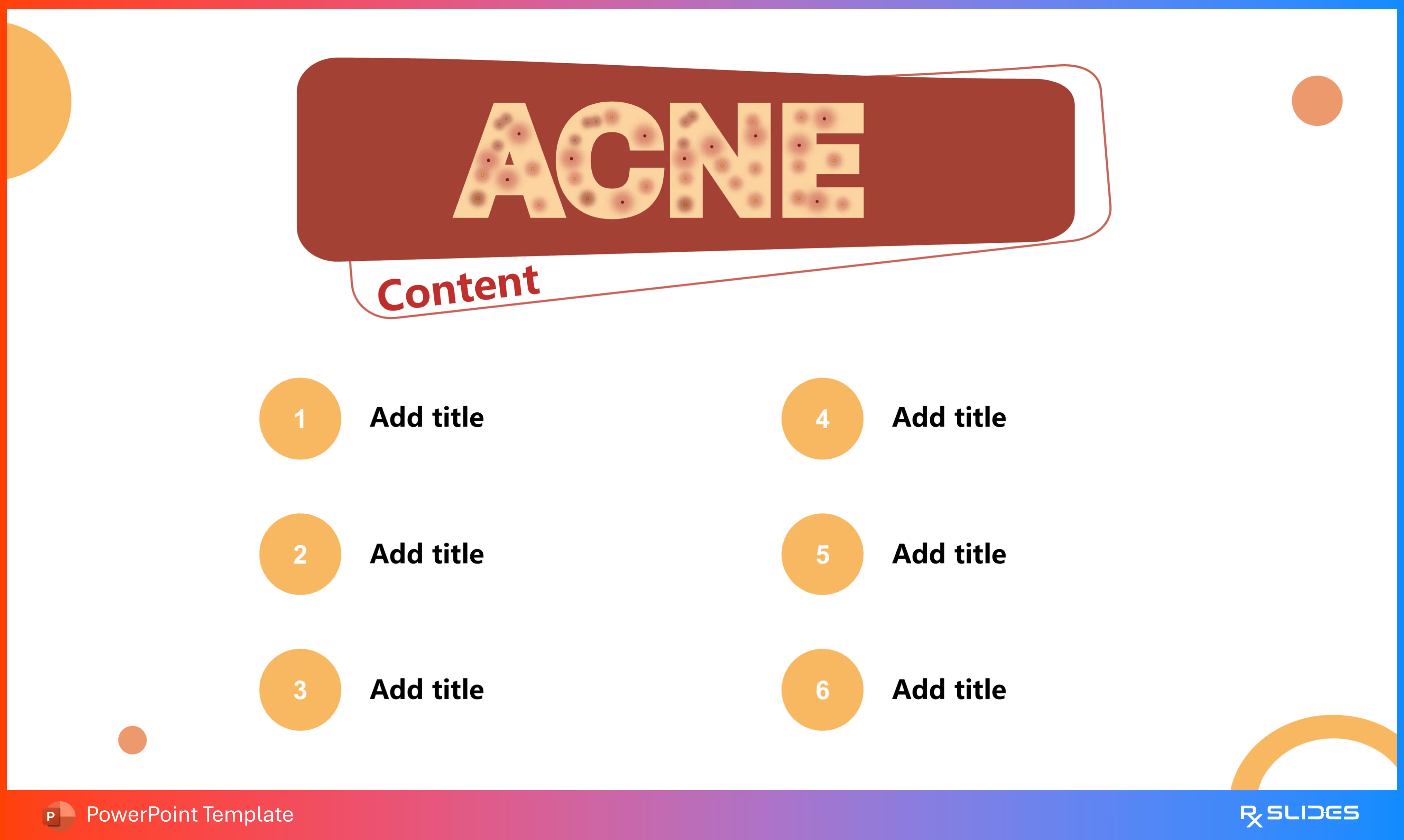
Use clean, organized layouts, such as a six-point grid or numbered sections, to present a roadmap for the discussion. The Acne Vulgaris PPT Template, for instance, uses a clean, circular design that organizes the entire talk into six organized, numbered sections.
Mark transitions between major data types (e.g., moving from epidemiology to pathogenesis). These dividers feature strong, relevant icons to visually reinforce the topic shift, such as a globe or world map for Prevalence, a warning sign for Risk Factors, or a microscope for Diagnosis.
2. Visualize the Scale of the Problem (Epidemiology and Prevalence)
Research data on incidence and prevalence establishes the necessity of the intervention or study. Templates use visual data tools to convey scale instantly.
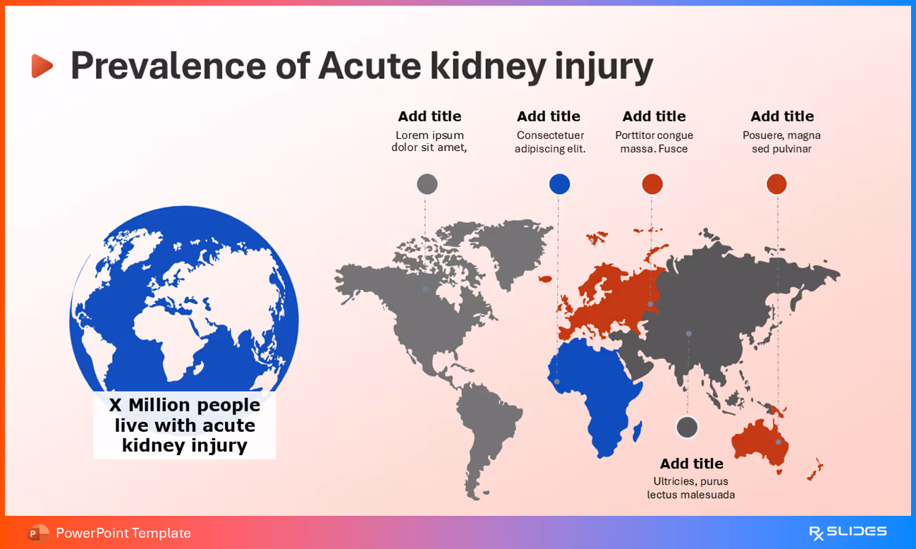
Utilize global maps to visually denote research areas or high-incidence regions. For example, the Acute Kidney Injury (AKI) Template uses an interactive map with editable pins to highlight key regions or countries affected by AKI.
• Charts and Graphs for Comparison:
COPD Prevalence (Gender Comparison) from COPD Template
Deploy bar charts to compare incidence rates across categories, or use donut charts to show proportional data, such as COPD Prevalence (Gender Comparison), using two distinct, colored doughnut charts to illustrate the difference between male and female populations.
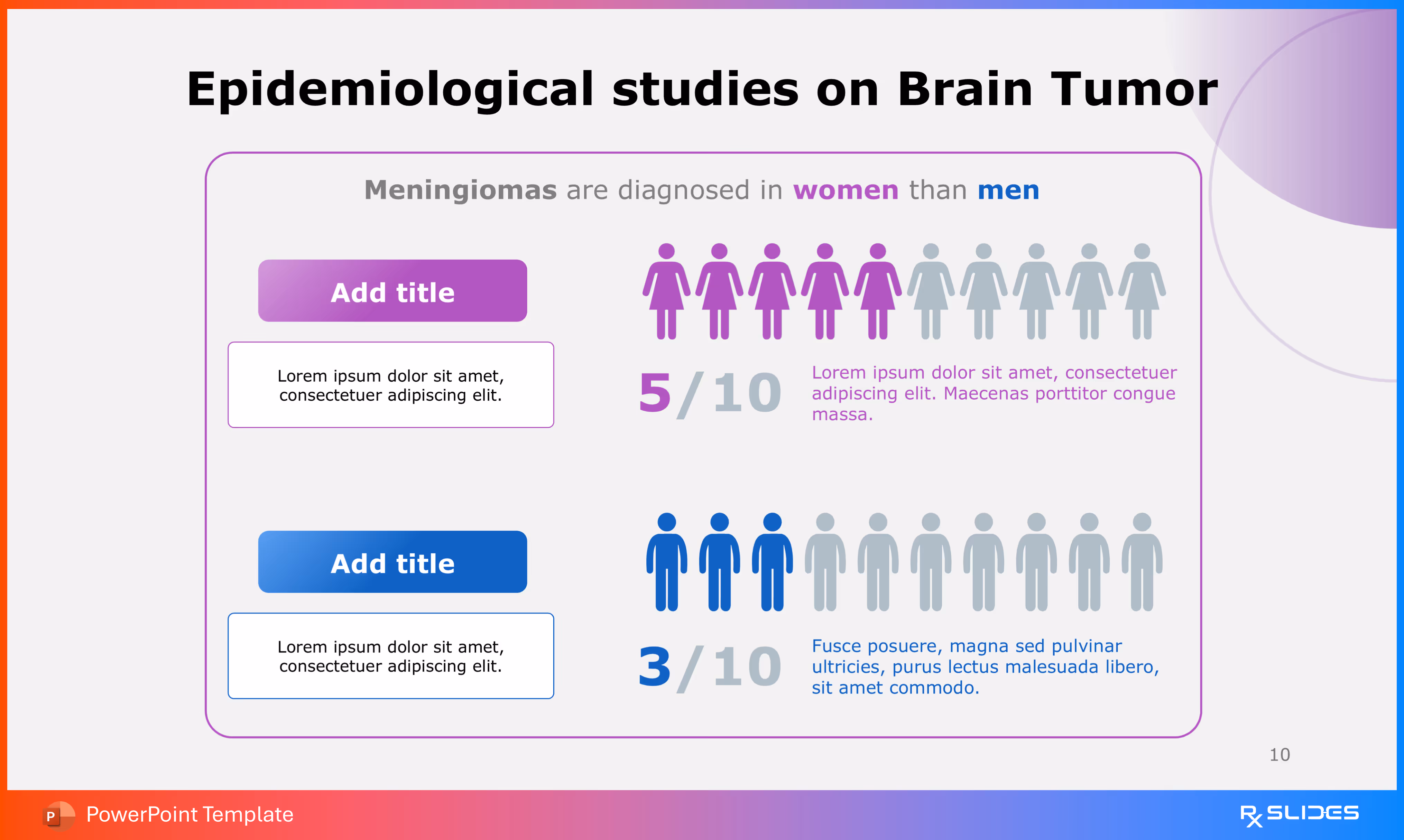
Visualize data by patient groups to identify target populations. The Brain Tumor Template uses large, full-body icon graphics and percentage circles to show the gender distribution of meningiomas, which are diagnosed more often in women than men.
3. Map the Complex Mechanism (Pathogenesis and Causes)
To turn biological mechanisms into a visual story, information must move from the abstract list of steps to a dynamic, sequential flow.
Show disease progression step-by-step. The Atherosclerosis Template details pathogenesis through flow diagrams and magnified artery cross-sections, showing the stages from endothelial damage to foam cells and ultimately the thrombus formation.
When causes are numerous and interacting, central infographics work best. The Acne Causes (Infographic Layout) presents key contributing factors, including hormonal changes, genetics, medications, smoking, bacteria, and stress, around a central patient illustration.
Use zoomed-in diagrams to explain damage at a microscopic level. For diabetic retinopathy, slides illustrate the difference between a normal capillary (with intact cells) and a damaged capillary.
4. Conclude with Action (Treatment and Prevention)
The final part of the story provides the resolution, summarizing the data's implication for patient management.
Present comprehensive treatment plans using structured formats like grids or radial diagrams. The Acne Care (Flower Diagram) uses a seven-petal design to organize the pillars of acne management, including medications, procedural treatments, and self-care regimens.
Translate research into actionable lifestyle changes using visual sequences. The P.A.D. Prevention (Flow Chart) uses a sequence of five red circular icons connected by arrows, illustrating the continuous nature of prevention (stop smoking, eat a healthy diet, exercise regularly, etc.).
By utilizing these templates, complex factual research data is transformed from mere statistics into a dynamic and appealing narrative that keeps the audience engaged.


.avif)
.avif)
.avif)
.avif)
.avif)
.avif)