What are the Best Ways to Visualize disease prevalence in PowerPoint?
The most effective ways to visualize disease prevalence and epidemiology in a PowerPoint presentation involve using dynamic, topic-specific charts, maps, and comparative infographics to break down statistical data by geography, gender, and disease severity.
Here are the best ways to visualize disease prevalence, categorized by visual method, with examples from the sources:
1. Geographic and Global Distribution
Visualizing data spatially helps establish the scale and global burden of a disease.
• World Maps with Callouts:
Templates utilize global distribution maps that feature editable pins and numbered legends to highlight key regions, countries, or population groups affected by a condition.
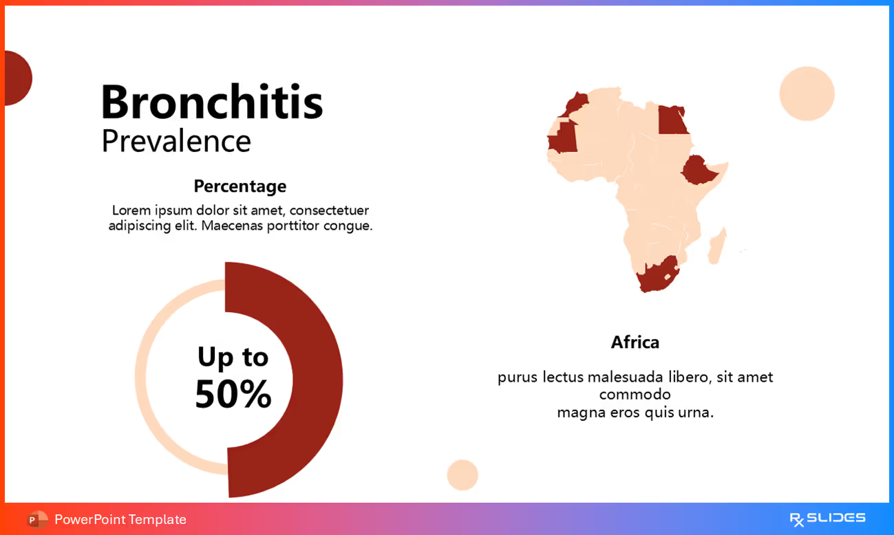
◦ Example: The Acute Kidney Injury (AKI) PowerPoint Template offers a slide to show global AKI prevalence with an interactive map. Another layout highlights the worldwide burden using a global map with region-specific callouts and data boxes for total global estimates.
• Regional Map Focus:
Presentations can zoom in on specific regions where the disease burden is high.
◦ Example: The Coronary Artery Disease (CAD) Template features horizontal bar charts where a stylized artery cross-section icon with varying degrees of plaque buildup is placed next to the data bar, suggesting a correlation between prevalence and disease severity.
• Pie and Donut Charts:
These circular charts are used to show proportional data or market share related to a disease.
◦ Example: The COPD PowerPoint Template uses two distinct, colored doughnut charts to illustrate the prevalence of chronic obstructive pulmonary disease across genders.
◦ Example: For Peptic Ulcers, a data slide uses a pie chart divided into three segments to represent the prevalence and distribution of ulcers (e.g., gastric vs. duodenal) or their causes.
◦ Example: The Brain Tumor PowerPoint Template uses large, full-body icon graphics and percentage circles to show the gender statistics for specific tumors, noting, for example, that Meningiomas are diagnosed more often in women than men.
◦ Example: The Sleep Apnea Template includes an Epidemiology Gender Prevalence slide to discuss risk factors and prevalence differences between male and female populations.
• Age Group Visualization:
Data should clearly highlight the most affected age brackets.
◦ Example: The Acne PowerPoint Template includes a slide titled Rate of Acne by Age Group, which visualizes incidence rates across specific age groups such as adolescent, adult, and late-onset populations.
4. Progression and Severity Infographics
Visualizing prevalence data in the context of disease stage helps justify therapeutic need by showing how many people reach critical stages.
• Severity Flow Diagrams:
These visuals link statistical data placeholders to illustrations showing worsening pathology.
◦ Example: The Atherosclerosis PowerPoint Template uses a Severity Infographic featuring three vertical cards. Each card contains a cross-section of a blood vessel showing progressively greater plaque buildup, representing the low, intermediate, and severe stages of the disease, each associated with a placeholder statistic (XX%).
◦ Example: The Diabetic Retinopathy Template illustrates disease progression using three numbered eye diagrams, showing a gradual increase in vessel damage and hemorrhages from stage 1 to stage 3.


.avif)
.avif)
.avif)
.avif)
.avif)
.avif)


.avif)
.avif)